Viger1/dsh-design
dsh-design
Design taste your agent can be held to — a design-system skill plus design_audit, which measures the rendered page (type scale, contrast, spacing grid, palette drift) instead of trusting it looked right.
Install
npx @deepseek-ai/dsh plugin --profile web add dsh-designRestart `dsh web` after install. Bundle APIs can change during the developer preview.
README badge

[](https://dshhub.dev/plugins/dsh-design)Paste this into your README. The star count updates with every catalog sync.
From the README
Excerpt from Viger1/dsh-design, cleaned of badges and images.
dsh-design
English | 中文
The only thing in this ecosystem that measures design rules on a rendered page.
Design tooling here splits into two buckets, and both leave the same hole. Generators produce a design and stop. Prompt-only skills hand the model a list of rules with nothing checking whether it followed them. Static analyzers parse CSS files, which cannot see what the browser actually painted: alpha composited over the real backdrop, utility classes after they resolve, a runtime theme switch, or the tap-target box as laid out.
dsh-design renders the page and measures it. "It looks good" becomes a number you can argue with — including the specific tells of a generated-looking page, which no other plugin checks at all: violet gradients caught by hue angle rather than a string match, emoji standing in for iconography, and type that fell back to the browser default because no family was ever chosen.
Same brief, two agents
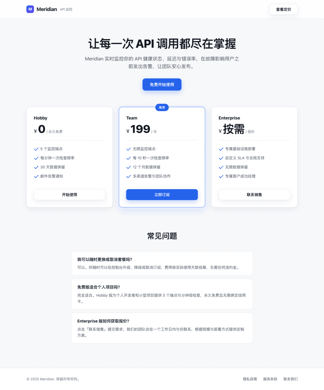
One brief — a pricing page for a small API-monitoring product, Chinese UI, single self-contained index.html. Two runs on the same model and the same harness. The only difference is whether this plugin was doing anything.
| Without the plugin | With the skill + audit loop |
|---|---|
| Measured at 1280px | Without | With |
|---|---|---|
| Violations | 4 | 0 |
| Distinct type sizes | 11 — 12 13 14 15 16 17 19 20 30 44 46 | 6 — 14 16 20 24 32 40 |
| Off-grid spacing values | 10 — 5 6 10 13 14 15 18 26 30 226 | 0 |
| Tap targets under 24px | 3 | 0 |
| Generated-design tells | 1 — a violet gradient on the logo mark | 0 |
| Non-neutral colors | 1 — rgb(37, 99, 235) | 1 — rgb(15, 92, 68) |
| Elements sampled | 71 | 78 |
The baseline is not bad work. It is competent, and that is the point: it is the centered-blue-SaaS page you have already seen several hundred times, and it reached for a violet gradient unprompted — the exact tell the purple-gradient rule exists to catch. Underneath the competence it is improvising, with eleven type sizes and ten spacing values that belong to no scale.
The guided run committed first — one warm neutral ramp, a single deep green used only for the primary action and the recommended tier, six sizes, spacing on 4px — then audited. Round one found one violation (footer links at 22.4px tall); round two came back clean across 78 elements. Both pages spend exactly one accent, which is the palette rule reporting that neither page's problem was color.
Reproduce it yourself: the brief and both outputs are in examples/pricing-page/. One run of each, so treat this as an illustration of the difference rather than a benchmark. The baseline was also told to write the page and stop, so it never got a revision pass — an unguided run allowed to iterate is the arm this comparison does not have.
What it measures
…