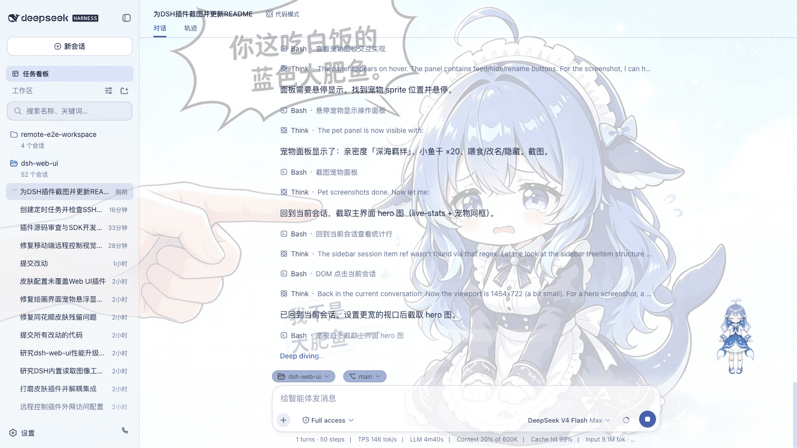
lispking/dsh-qq-skin
dsh-qq-skin
A QQ NT messenger skin for DeepSeek Harness (dsh). Light and dark share one QQ NT language.
Install
npx @deepseek-ai/dsh plugin --profile web add dsh-qq-skinRestart `dsh web` after install. Bundle APIs can change during the developer preview.
README badge

[](https://dshhub.dev/plugins/dsh-qq-skin)Paste this into your README. The star count updates with every catalog sync.
From the README
Excerpt from lispking/dsh-qq-skin, cleaned of badges and images.
dsh-qq-skin
A QQ NT messenger skin for DeepSeek Harness (dsh). Light and dark share one QQ NT language — light mode is clean and restrained (near-white surfaces, neutral borders/hover, brand blue #12B7F5 and light-blue bubbles #A8E3FF as recognition accents), dark mode is a calm blue-gray (base #101822, desaturated, blue reserved for accents), instantly recognizable. Ships with five palette variants (Classic Blue / Vivid Purple / Clean White / Green Bubble / Deep Black), configurable toggles and sizing, plus a settings-panel visual switcher with hot reload.
How it works. The skin is two reversible layers; it never registers a new theme id and never touches the user's Light/Dark/System preference.
- Token layer — stacks one
--dsw-*semantic-token override viactx.theme.overrideTokens('dsh-qq-skin', ...). Every token carries a{ light, dark }pair, so the skin follows the active base palette instead of fighting it. Light mode runs blue through surfaces, borders, interactions, and scrollbars; the dark palette is a#101822-based calm blue-gray scale where blue only accents (brand, bubbles, primary buttons). The set is generated per palette (buildTokenOverrides(palette)): the five palettes share the neutral blue-gray skeleton and differ only in the personality tokens.- Layout layer — injects one global
<style>tag (qq-layout.ts) for geometry and structure: the chat flow is centered and narrowed, user bubbles are light blue with a "tail", assistant rows get an avatar disc + white card (matched viadata-chat-flow-kind='assistant-step'), the input area becomes a capsule, plus a slim conversation-header divider, QQ-styled timestamps and scrollbar, and sidebar session-row hover/selected states. The brand area stays product-native — the QQ feel comes entirely from the blue token layer. Colors always come from--dsw-*tokens, and dark variants are gated bybody[data-ds-dark-theme]. The CSS is generated from the config (buildQQLayoutCss).On unload both layers are fully removed through effect cleanup and the product look returns. Settings and config changes hot-reapply both layers via
QQSkinRuntime.updatewithout restarting the plugin.
Screenshots
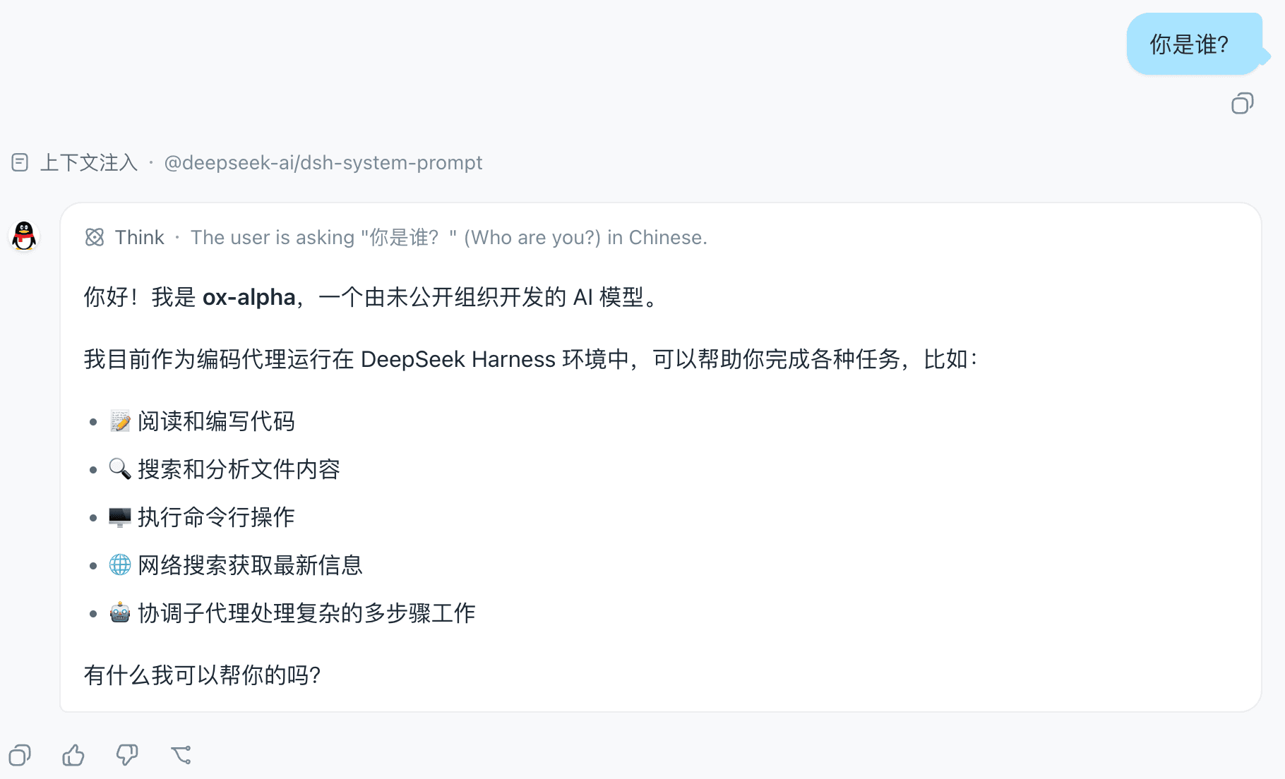
The chat view in the Classic Blue palette: centered, narrowed chat flow, light-blue user bubbles with a "tail", and the penguin avatar disc on assistant rows:
The QQ Skin settings row in the App settings General section, with the palette / bubble tail / assistant avatar / chat width toggles:
Settings panel
The skin registers a QQ Skin settings row in the App settings General section, with visual toggles for palette / bubble tail / assistant avatar / chat width. Changes apply immediately (hot reload remounts both layers) and are persisted to the user-settings document. The settings panel overrides the static config below.
Configuration
The plugin receives config the cordis function-plugin way (apply(ctx, config)); unset fields fall back to defaults:
…